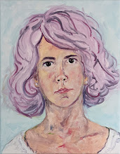
Winter painting:
 An instance of painting what I see, and leaving out detail is evident in one of my newer paintings, Young Girl with Fan. Intellectually, I know that this young girl has blond hair. But when the sun light was shining in her hair, it looked like golden honey. And maybe her eyes aren't exactly that shade in real life, but the look in her eyes is just as sweet and true. What I really like, though, is the precious smile, most likely caused by the fact that she was the undivided center of attention of two teenage young ladies. How sweet and wonderful life is when we are priviledged enough to see true delight in the eyes of a child.
 Mexicans are very enthusiastic about life. Celebrations and festivals start with booming cannon fire way too early in the morning, and continue long into the night with sporadic, yet continuous fireworks. By the end of our week in Mexico this past summer, I was yelling, "Viva la revolución!" at each thunderous bang. (Though corrected for my ignorance of the actual date of the Mexican revolution, the loud booms naturally prompted my visceral response, especially considering that we were in Mexico, and my "command" of the Spanish language is limited to various, easy-to-learn phrases.)


 Though clownish by nature, harlequin is and always has been one of my favorite designs. It is perhaps for this reason that Picasso remains in my top twenty artists. Picasso used the harlequin design in several of his paintings. In Harlequin with Glass, Picasso put himself in a harlequin costume surrounded by friends, or at least acquaintances at a cafe. It looks like he was heavily influenced by Toulouse-Lautrec with the rather cartoonish figures in the background. The painting is a departure from his more somber blue period with his addition of reds, yellows and greens with warmer tones of brown for a background.
 Another painting of his with a harlequin design is Family of Saltimbanques. Even though the family members seem distant emotionally, the physical proximity of the figures, especially with the father holding his young daughter's hand, is altogether charming. Much has been written about the melancholy nature of the figures, but to me they seem content in each other's company.
 Perhaps my favorite Picasso painting of all is Paul in a Clown Suit. The absolute command of his portrait abilities is reflected in the subtle expression on Paul's face. Masterfully drawn, the sketch like quality of the rest of the painting further emphasizes our focus on his son's face. We aren't distracted by frivolous lace or an ornate chair. We only see a father's love for his young son. Given Picasso's well-documented narcissism, it's pleasant to see a painting that demonstrates a love for someone besides himself.
 The point is that in the last two weeks, I have made tremendous strides toward several painting projects, though I'm still miles away from the finish line. OK, maybe yards instead of miles, but still several paintings are in the works. And with this busy season, there is conflict with the desire to paint versus the desire to be a good mom. But what does it mean to be a good mom? In this instance, part of it involves the whole Santa conundrum.
 Our alpha male white toy poodle, Skipper is head over heals in love with the at least four times his size Blondie, the Xoloitzquintle, or Mexican hairless dog who lives a few doors down. When Blondie's owner, Fran drops in, she usually brings Blondie with her, which absolutely thrills our little poodle. Skipper spends most of his time trying to become intimately acquainted with Blondie, which is endlessly annoying to my friend's pet. Skipper is completely undaunted with his one-sided devotion and admiration of the large mostly hairless Latin lady dog.
 Over the weekend, The Amazing Reese and I went to Austin to watch sweet daughter Erin graduate from UT.
 In the newest painting in the works, I decided to paint the entire background basics in complementary colors. So far, the sky is a pale orange, the shrubbery is deep red, the tree is dark yellow, and the rest is a cross between tan and pale yellow. It looks pretty cool, and my daughter, Anna suggested that I work in solids for the whole piece. Maybe. When it dries, I can start working in the complementary colors to create the piece/painting that's already in my head. The complement of the sky will be a pale blue. There will be a variety of greens in the shrubbery. The tree's basic color scheme will be lavender, with violet blues (or blue violets) in the background. Some of the background colors will peek through on the finished piece.


 I say still life, but tulips are anything but still. They kept following the sun, and opening and closing, so that I finally had to just paint them in place. Painting that day and the next did wonders for my fragile psyche.
 This morning was the second workshop for Via Colori, an upcoming street painting festival to benefit The Center for Hearing and Speech. Like before, we were given brief instruction, then went outside to a chalked off square to practice "painting." Between the last workshop and this, I have at least learned how to dress for the event....stretch jeans (to accommodate all the bending), a long undershirt (to cover the distance between the jeans and t-shirt as I bend over---think plumber), and a baseball hat to keep the sun and hair off my face.
 Part of our homework in preparation for the exhibit has been to visit other galleries. While we were there enjoying other Houston artists' works, we also studied these galleries and exhibits on a technical level. We looked at how pieces were curated, framed, promoted, priced, etc. Most galleries followed similar patterns, but all galleries have a unique personality.